Graphics and Icons are great tools and significantly important in Namirial communication besides emotional images. They explain content that seems unexplainable in a real-world environment but exists digitally. The clean style matches Namirial’s brand aesthetic and helps to speak one Namirial brand language.
Style
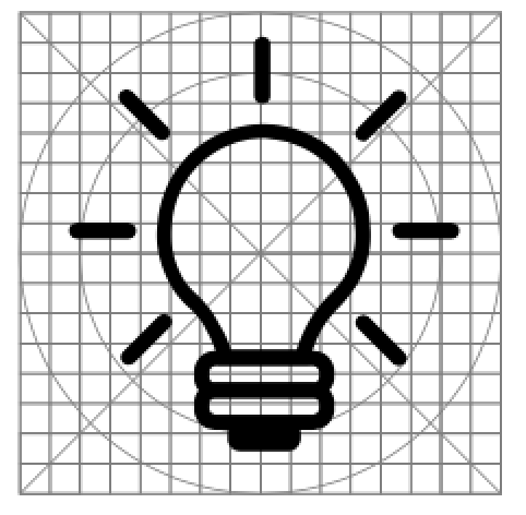
Consistent, lightweight icons that reflect Namirial’s clean, modern and valuable statements. Stroked icons give the great ability to create tiny details and tell compelling stories. This content icons are used on websites, in presentations and for print media.
Two colour system – Accent Iconography
- Used in cases where we need to tell a story in a more precise way. We can achieve that by pointing out minor details with color.
- The accent icons consist of background elements and the focus elements. We use a darker color (black) for the background elements and the base color for the focus elements.
- Advantages: more flexibility, better recognition, we can underline the importance of certain details.
Icon Library
Namirial Icon Library on  Google Drive
- Namirial Custom Icon Gallery
- Streamline Icons
- Namirial Hero Icons
- Nucleo Icons (old)
- Standard Web Icons (soon to be added)
| Standard Name | Color/s | Size | Usage | Example |
|---|---|---|---|---|
| A conventional name to understand what we are talking about | List of used colors | Squared pixel | Where the icon is used | An example icon that show the standard and usage |
| Menu Icons | negative: #FFFFFF highlighted: #33B8B1 | 16×16 | The Menu icons are solely used for the menu points in the top header section above the navigation. This part of the header has limited space, whereas the icons are in a small but still recognizable size. For the highlighted menu point it is recommended to use the lighter shade (#33B8B1) of the base color (#00423f) for a better contrast and accessibility | |
| Standard Icons | positive: #111820 negative: #FFFFFF colored: #00423f | large 80×80 middle 48×48middle 60×60 small 24×24 | Standard icons in one color, often used in combination with text. They should be relevant to the content, descriptive, straight-forward and easy to understand. |  |
| Standard Icons two colored | dark #00423f highlighted #00A69D | 80×80 48×48 icons used in the checkout list 40×40 | Standard icons in two colors, often used in combination with text. They should be relevant to the content, descriptive, straight-forward and easy to understand.The two colored system is a flexible way to give a in-detail explanation of the content. The lighter color highlights and brings forward important details. |   |
| Boxed Icons | Icon Color: #FFFFFF Box with rounded corners: #00A69D | Large Boxes Icon size: 40×40 Box: 64×64 Small Boxes Icon size: 24×24 Box: 48×48 | Descriptive icons for the services/ advantages that are listed in each section.large boxed icons are used for listed services/ description of services/ advantages that are usually in separate columnssmall boxed icons are in combination with text |   |
| Page Notification Icons | #005E8C | 24×24 | Notification Icons are visual indicators of processed actions |    |
| Error Notification Icon | #B50600 | 24×24 | Notification Icons for failed or canceled actions |  |
| Checkout Notification Icon | #00423f | 36×36 | Notification Icon (regarding checkout) |  |
| Button Icon: Checkout | Icon color: #33B8B1 Bound button: #111820 | Icon: 24×24 Button diameter: 48 | The round button with the card icon stands for checkout and will redirect the user to the checkout page. |  |
| Button Icon: External link | #35364A | 24×24 | Icon used inside buttons that indicates an external page |  |
| Footer Icons | #FFFFFF | 16×16 | Listing purposes |  |
| Footer Icons: Social Media | #FFFFFF | 24×24 | Icons that redirects the user to different social media platforms. Give Namirial a visit! |  new social media icons: new social media icons: |
| Product Logo Icons | Two colored: #00A69D and #111820 | dropdown menu: 36×36 on page: 64×64 | Icons of our products and services |   |
| Dropdown Menu Icon | #00A69D | 36×26 | one-time used icon |  |