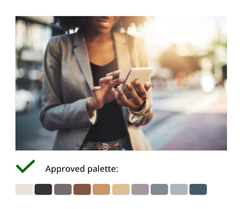
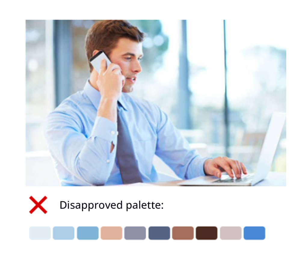
Using Color in Namirial Image Communication
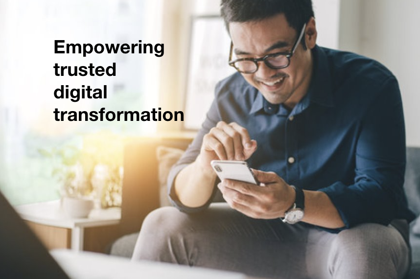
Namirial core brand value is “empowering trusted digital transformation”. In order to establish trust in changing to digital we strive to show interactions and scenes in a warm, light morning/evening sunshine light style – and avoiding domination of clinical cold/blue colors. We also want to significantly distinguish from some of our close competitors that are using predominantly blue color schemes.
Using People in Namirial Image Communication
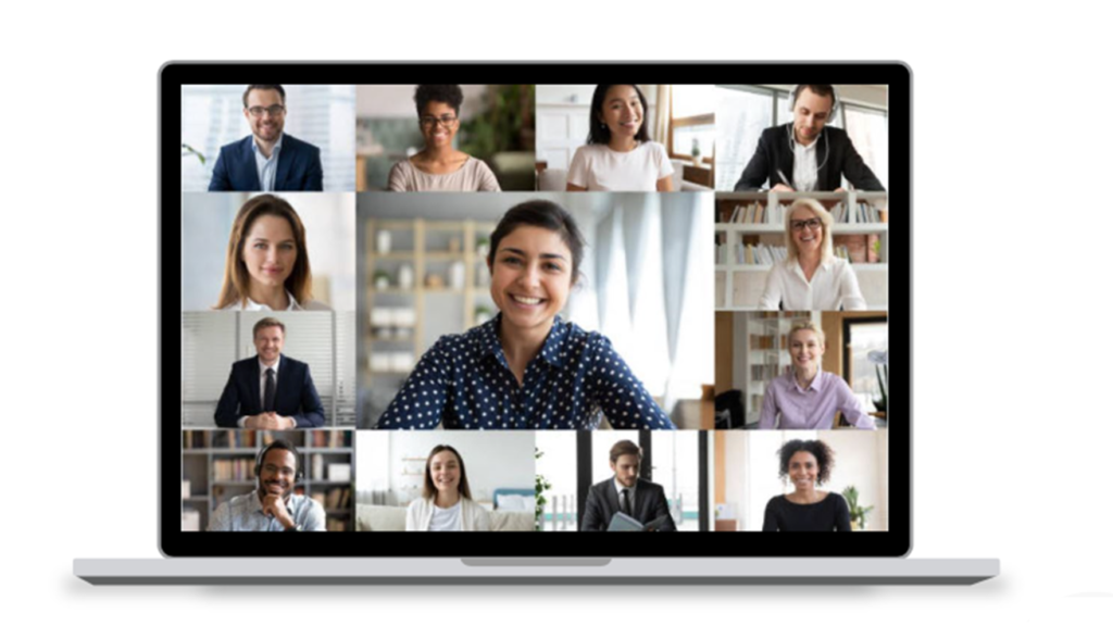
- People images used in our communications should be from diverse cultures and professions benefiting from Namirial technologies, reflecting our commitment to diversity as well as being a global supplier with business partners and customers all over the world.
- Their personality should be trustworthy, dependable, reliable, innovative, agile, smart, and embracing digital transformation.
Two types of shoots
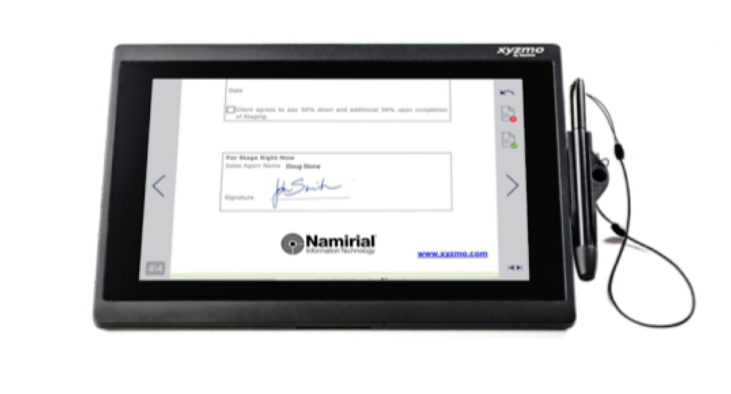
Typical product shoots – shows the device with its display on white background or cropped and presents a part of our software, either with a static screenshot or screencast (explains the interaction)
Emotional product shoots – shows the device in use, persons interacting with devices, tells the user story, images from different perspectives
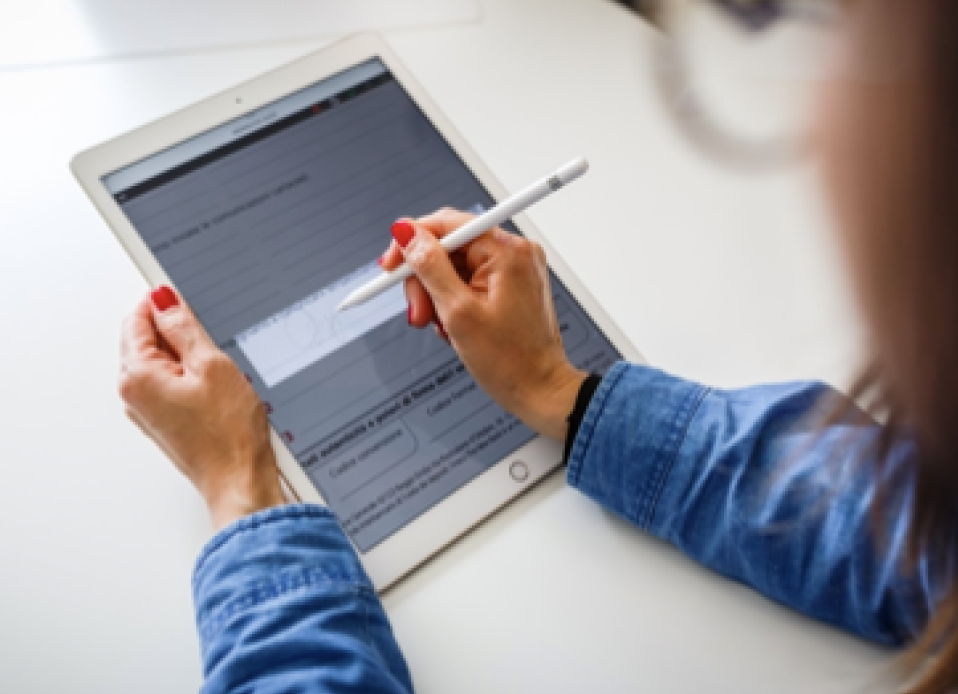
Image Selection Criteria
The criteria should match the interest of our buyer persona – they want to know what we can do to get their business challenges / problems solved. Therefore, we are focusing primarily on their interest in driving paper out of business with processes they perceive as trustworthy.
Tier 1 – Values reflecting Namirial value proposition: Empowering trusted digital transformation
- Empowering: People are shown as empowered and enabled in can-do-now, can-get-it-done situations
- Trusted: Interactions in confident, positive, happy manner – in business mode, so rather a little smile than open laughter (these people are comfortable in relying on our solutions / services)
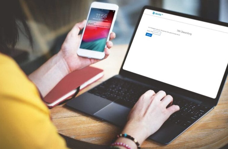
- Digital: Moving paper out of process
- Transformation: Interacting rather on mobile devices than desktop – devices may be sophisticated and should be rather “business class” – e.g. Apple iPad with Pencil, Samsung Galaxy Note with SPen (one of our core value propositions is that unlike most of our competitors we are also taking handwritten signatures seriously and embed them in digital processes)
Tier 2 – General trend values
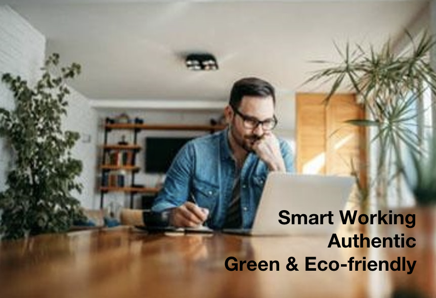
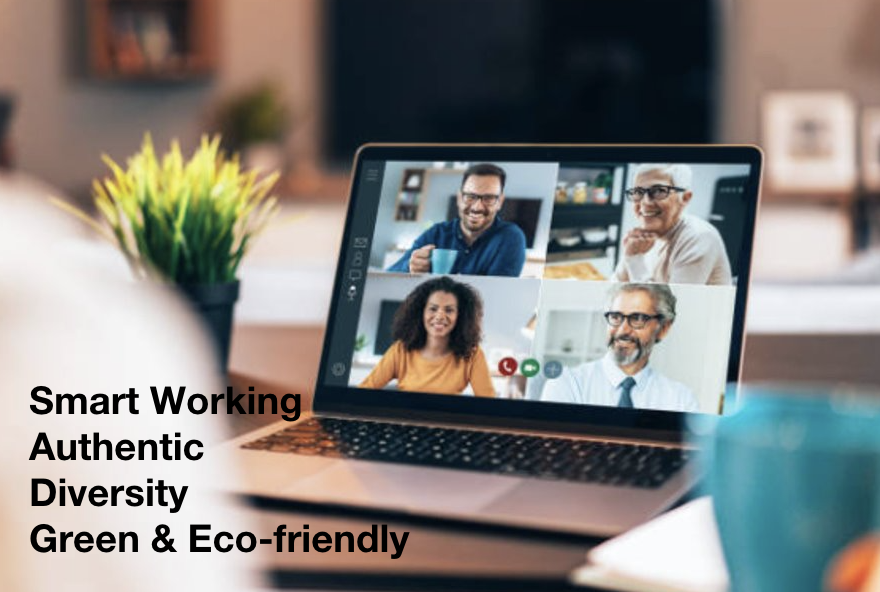
- Smart Working / “New Work”: Work anywhere (not just in the office – also in home office and on the go), agile, small team, “getting stuff done attitude”
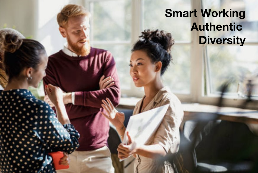
- Diversity: Working in teams with people of different age, different gender (in particular women in business not only “white old men”), different ethnic background (skin colour), cultural background
- Authentic: Natural snapshot impression, not staged / acting (e.g. people grouped together and made smiling, jumping)
- Green & eco-friendly: Show modern and “paperless” office and support a clean, green environment
Best Practice in Image Selection
- Primarily show interaction with tablet, smartphone or laptop as we want to be our customers and their customers to be as mobile and as flexible as possible
- Think about the “story” of your image – What does it tell and how does it support our messaging? Treat a photo as content to tell the Namirial story.
What to avoid

A “photoshopped appeal”, make sure to create a natural authentic look

Too many details in foreground or background, either not helpful to explain situation, product or service (e.g. messy desk)

Business clichés (e.g. hand shake etc.) and images providing the impression of being arranged and/or photoshopped and hence over-engineered
Real life example fullfilling Best Practices
These images have been selected to support news posting on online completion of temporary employment contract.

Realistic graphic concept
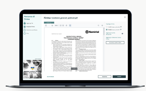
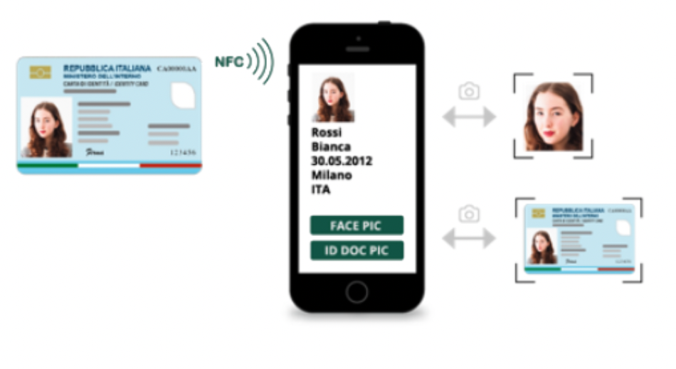
Create more realistic styled graphics to get closer to our approach of showing real life images. In case of showing screenshots or screencasts frame it with a realistic styled graphic shape. Use of slim and new device shapes, but independent of the suppliers. There should be device templates for Android, Windows and Apple, as we offer software over all these platforms.
Screenshots and Screencast should be real, as it is easier for the users to get an idea of how something works in reality. To explain a story even better graphical elements can be adopted. Mind that personal information in screenshots or screencasts need always to be blurred because of sensitive data.
Why do I use here graphics instead of real life photographs of devices? – because it’s easier to stay flexible when creating infographics and as they get closer to a more uniform graphical style, it’s the bridge between reality and graphics.
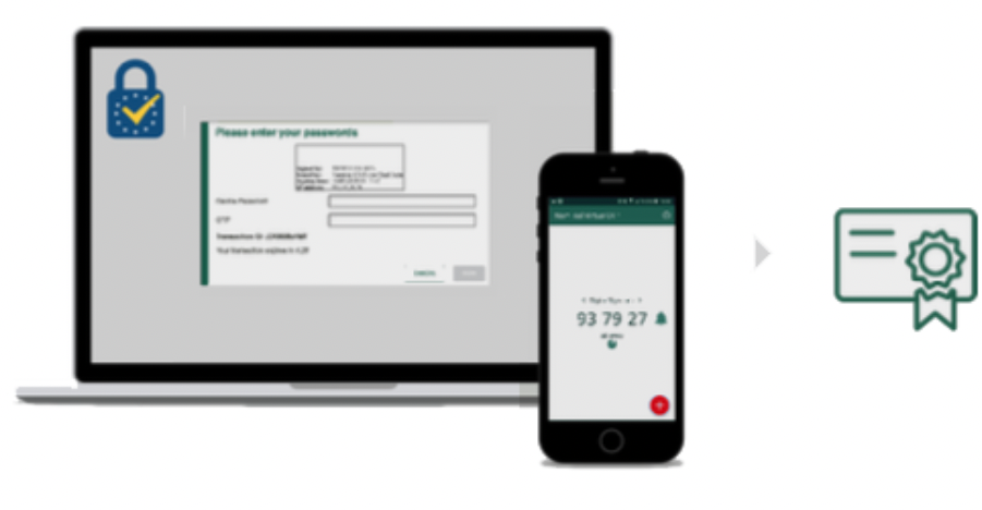
Infographics
Realistic concept combined with graphic elements and icons (Infographics) to describe and visualize the story more precisely. Used when it gets into detail, for description graphics.
Key Guidelines and Factors: What to Take into Account in Image Finding
A checklist of fundamental technical aspects, while searching for an image:
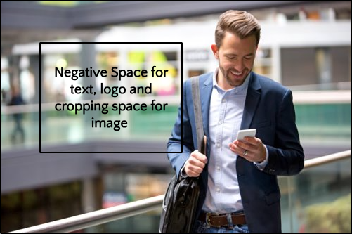
- Composition:
- Negative space to create simplicity, minimalism and to focus on the main object. It is the area between and around the object, and positive space in a photo. It can be created through blurred, clean, light, dark, colored backgrounds. The advantages are space for texts, logo, typography and flexible usage of cropping, masking images for any case
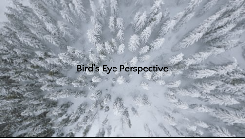
- Viewpoint and Perspectives
- You as an inspector of a scene (bird’s eye perspective, from the side, eye level with distance)
- You in direct contact with the object (eye level, close up, creates more emotions)
- You see through the person’s eyes (from back, bird’s eye perspective, for direct product presentation)
- Color/Mood: bright, sunlight
- Orientation: depending on the use case, but mainly horizontal images and framed images
- Size/Resolution:
- for web – medium resolution, full screen images (2880 x 1500px), file size <100KB
- for print – can be far bigger, good quality images are needed, resolution 150-300 dpi or more
- File Format:
- for web
- graphics in svg, png or gif (animations)
- images in jpeg or png (if transparent background is needed)
- for print:
- graphics in svg and/or eps
- images in jpeg and/or tiff
- for web
- Compliance: Ensure compliance with copyright laws: Only use licensed clip art, photography and icons. When using Creative Commons make sure to provide appropriate license information: https://creativecommons.org/licenses/?lang=en