Trademark • Marchio
Optical correction on reductions • Correzione ottica su riduzioni
Logotype • Logotipo
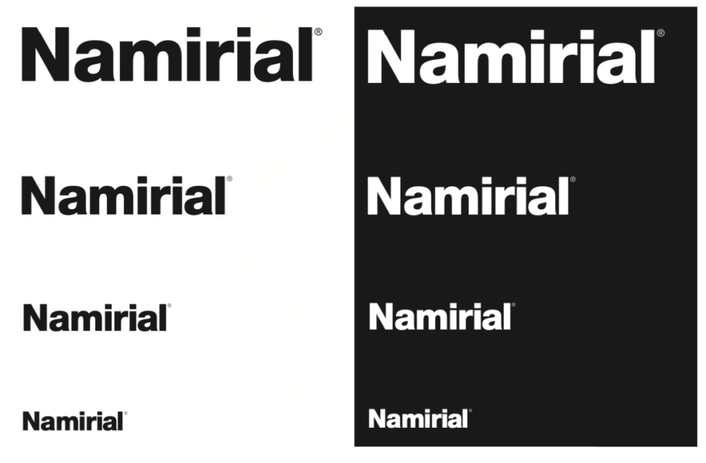
Body Naming • Corpo del testo:HelveticaNeue LTStd 85Heavy

Namirial Institutional Trademark & Logotype • Marchio Logotipo Istituzionale Namirial
Logo Usage
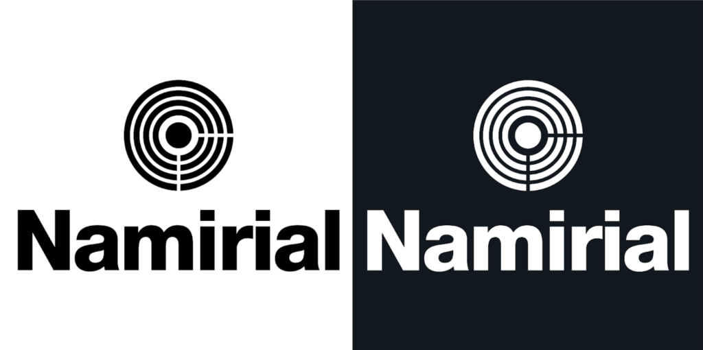
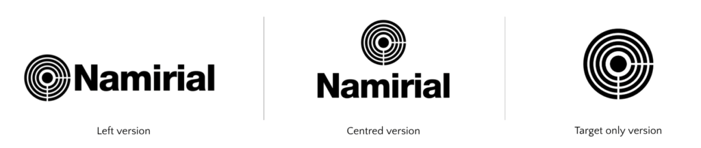
There are two versions of the Namirial Logo. A version with the Target positioned on the left or above the Logo text. Which one to choose depends on layout, format and text orientation. It should harmonize with surroundings.
Spacing
For a clear appearance give the Logo enough room for breathing, which means that there should be sufficient space around it. Avoid placing the Logo in cramped areas or too close to edges. The minimum margin is measured by the height of the letter N.

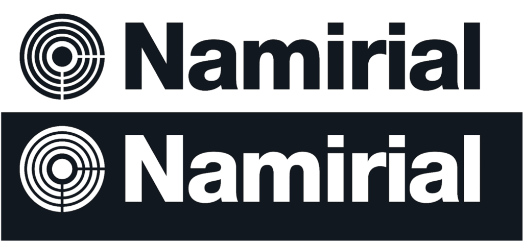
Logo in combination with a background
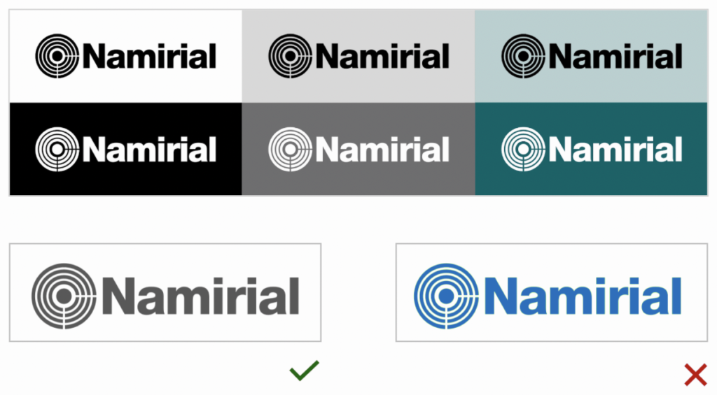
The Namirial Logo can be used either in black (positive) or white (negative), depending on what kind of background the Logo is going to be placed in. We recommend to place the positive Logo on white or lighter fields, while the negative version should mainly be used when the background is dark.
To reduce the contrast between Logo and background, the logo can be used in a lighter black or even in a grey tone. Though it is not allowed to fill the Logo in a different colour.
Resizing and Proportions
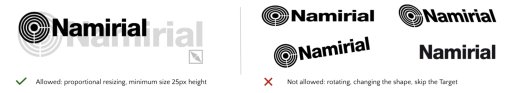
If you want to change the size of the Logo make sure that you keep the proportions. Do not distort or rotate the logo in any way. While the Target can stand alone without the company name (e.g as an Icon on Social Media or as a design element for graphics) the company name shall not be separated from the Target.
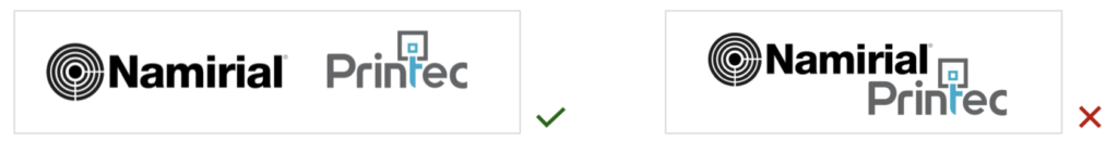
Combination with other logos
Combining the Namirial Logo with Partner Logos is allowed, if both logos are kept separately. Combined Logos should have same hierarchy in size and position. Don’t pair Namirial Logo with random brands or logos.