Font family
Helvetica Neue
Namirial chose for its communication the font “HelveticaNeue LTStd“. Using this font requires a license (owned by the Teams UX & Design and Marketing).
Open Sans
Fallback font for the web is Open Sans, a free font you can download or include directly in your web apps. The font is entirely available here.
Open Sans variants
When you include or download Open Sans, you need to consider at least two different weights: Regular 400 and Regular 400 Italic + Semi-Bold 600 and Semi-Bold 600 Italic. Collecting more variants could be better, but you can always avoid and ignore the Extra-Bold 800 and Extra-Bold 800 Italic.
Font-size
The standard font-size for the paragraph or labels on the web should be at least 16px (or equivalent). Using a smaller size (13px or equivalent) is an acceptable exception for helping text or menu items. For leading paragraph, the standard size is 20px or equivalent.
Font-weight
We utilize two standard font weights in our typography choices:
- Semibold (strong): This font weight is assigned a numerical value of 600. It offers a visually stronger and more prominent appearance, enabling effective emphasis of specific elements within the text.
- Normal: This font weight has a value of 400 and serves as the standard weight for regular, non-emphasized text. It provides a balanced and neutral appearance, ensuring clarity and readability without any additional emphasis.
By incorporating these two font weights, we can create contrast and hierarchy within our typographic designs, enabling effective communication and differentiation of various text elements.
Line-height
In general, it is recommended to adjust the line-height to optimize the readability and visual presentation of text in various contexts, such as websites or documents. When using the Open Sans font, a suggested approach is to set the line-height at 130% for headers (h1, h2, etc.) and 150% for paragraphs (p). By increasing the line-height within these ranges, you can introduce adequate spacing between lines, thereby improving the clarity and legibility of the text. This adjustment allows for easier reading and enhances the overall aesthetic appeal of the content by preventing the text from appearing crowded or cramped.
Letter casing
Uppercase
Since it is harder to read text in all caps, generally it is better to avoid uppercase. Uppercase is acceptable just for acronyms already described or well known (eg. SPID, REM, PEC, WCAG, IVA, TVA).
How to use Acronym
It is recommended to use the HTML tag <abbr> with the full name in the title.See HTML<abbr> Tag
Capitalize
We use capital letters in a few cases:
- To start a sentence;
- For proper nouns;
- Contractions (eg. Wi-Fi);
- Some acronyms (eg. eSAW, AgID, eIDAS).
Font styles
Using bold is the best way to emphasize a word, or a part of a sentence. It’s better to avoid using bold formatting in titles and subtitles, as they should already convey importance and conciseness.
Having a plain text is boring, that’s why it is important to give movement and emphasis by adding styles to your body text.
Italic/Emphasis could be used for citing the author of a quote.
Never underline a word if it is not a link.
Text decorations & colors
Link has to be always underlined and coloured with our accent color. Additionally, it is important to underline that underlined text should only be used for links, and not for non-linked text. Furthermore, for normal text that is not linked, it is recommended to use a neutral color with appropriate contrast for optimal readability.
Text alignment and line length
The alignment should be generally left, but titles and short lead paragraphs could be centered. In some specific case you can use right alignment, eg: to give more emphasis, styling block quotes or claims over photos.
The optimal line length for your body text is considered to be 50-75 characters per line, including spaces.
Text on images
Headlines, sublines and text should be readable on every background. This can be achieved through:
- High contrast between text and backgrounds
- Good sizing of text
Enough whitespace to give the image space to breath. Text should not overlay the main image object.
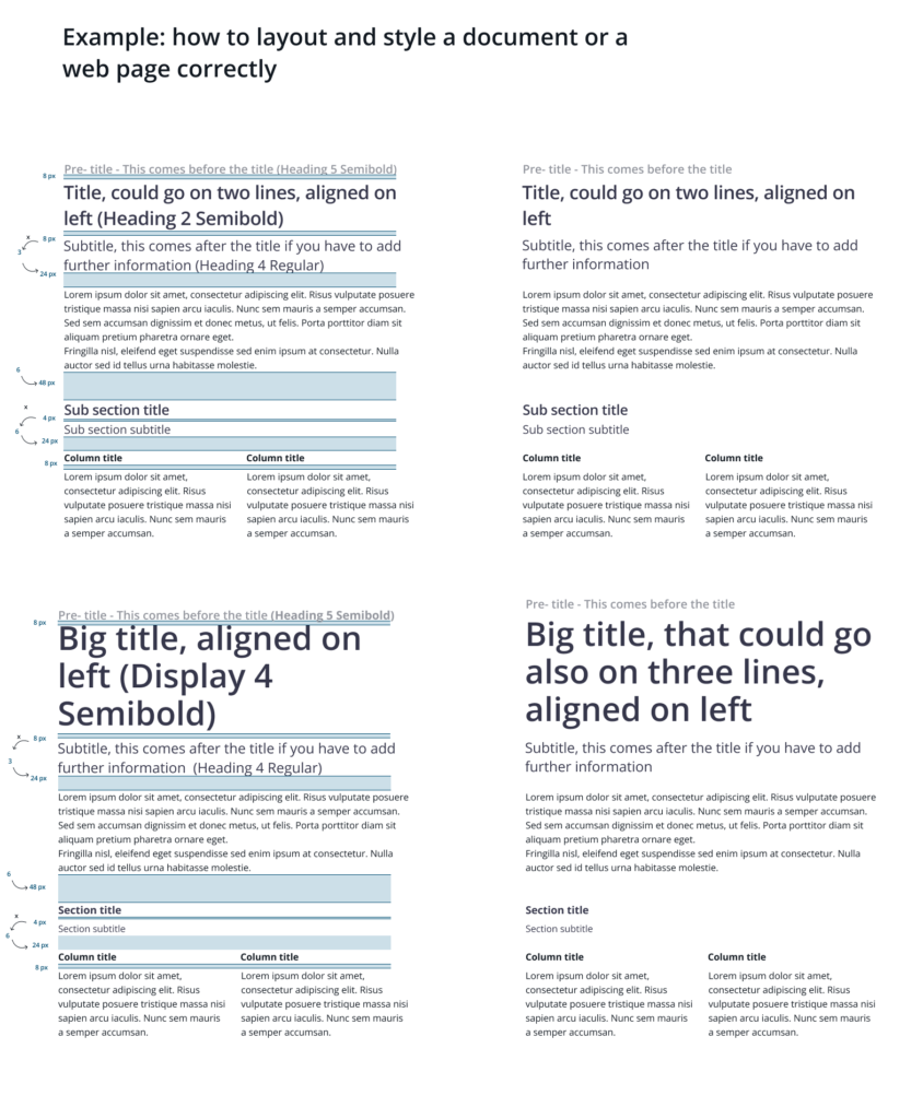
Display Titles, Headings and Paragraphs
There are six standard headings and four display text, in case you need a bigger text. Also other elements are available.
| Title | Font-size (px or equivalents) | Font-weight (available) | Line-height |
|---|---|---|---|
| display-1 | 96 | Semibold, Regular, Bold | 130% |
| display-2 | 88 | Semibold, Regular, Bold | 130% |
| display-3 | 72 | Semibold, Regular, Bold | 130% |
| display-4 | 56 | Semibold, Regular, Bold | 130% |
| heading-1 | 40 | Semibold, Regular, Bold | 130% |
| heading-2 | 32 | Semibold, Regular, Bold | 130% |
| heading-3 | 28 | Semibold, Regular, Bold | 130% |
| heading-4 | 24 | Semibold, Regular, Bold | 130% |
| heading-5 | 20 | Semibold, Regular, Bold | 130% |
| heading-6 | 16 | Semibold, Regular, Bold | 130% |
| Paragraph | Size | Styles | Line-height |
|---|---|---|---|
| XL | 24 | Semibold, Regular, Bold, Emphasis | 150% |
| LG | 20 | Semibold, Regular, Bold, Emphasis | 150% |
| MD | 16 | Semibold, Regular, Bold, Emphasis | 150% |
| SM | 13 | Semibold, Regular, Bold, Emphasis | 150% |