Accessibility
Within the Accessibility chapter, our design system adheres to the highest standards outlined in the Web Content Accessibility Guidelines (WCAG).
Within the Accessibility chapter, our design system adheres to the highest standards outlined in the Web Content Accessibility Guidelines (WCAG). Focused on achieving maximum accessibility, it prioritizes features such as keyboard navigation and optimal color contrast. This chapter outlines practical implementations and considerations, ensuring a commitment to universal design principles and inclusivity.
Web Content Accessibility Guidelines (WCAG)
WCAG, or Web Content Accessibility Guidelines, are a set of internationally recognized standards developed by the Web Accessibility Initiative (WAI) of the World Wide Web Consortium (W3C). These guidelines provide a comprehensive framework to ensure that digital content is perceivable, operable, understandable, and robust for individuals with varying abilities, promoting inclusivity across web platforms. As of now, WCAG 2.1 stands as the recommended standard for creating accessible digital content.
User needs
In recognizing the diverse nature of user needs, we acknowledge that accessibility adjustments cater not only to permanent conditions but also consider temporary and situational disabilities that anyone might experience.
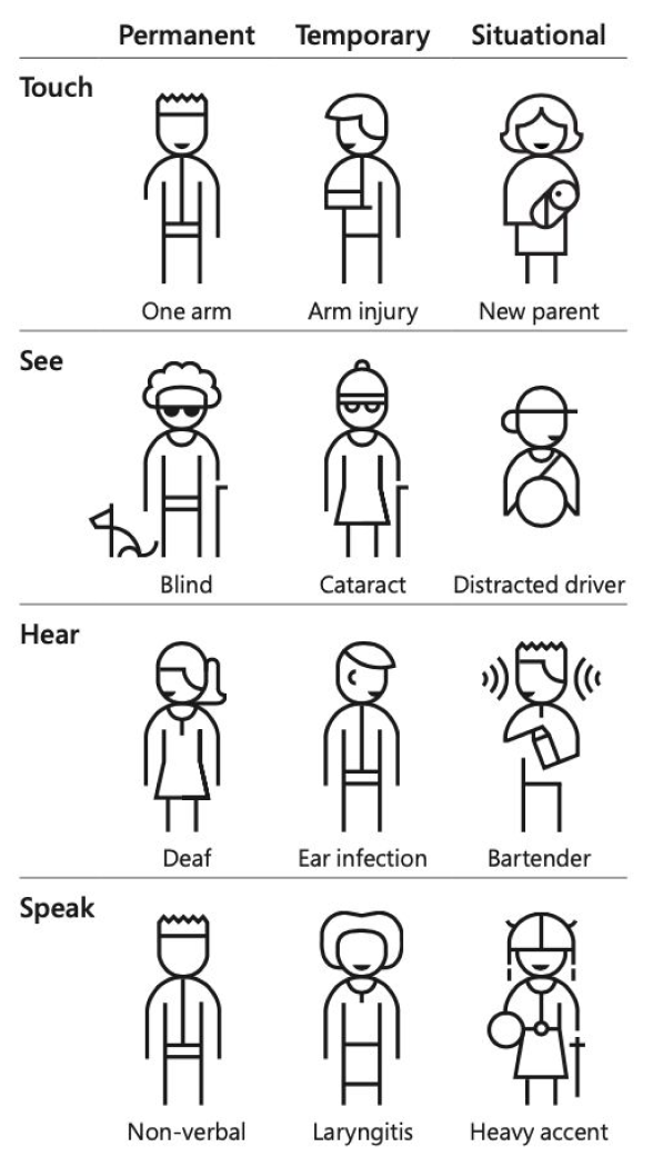
| Type | Description | Example |
|---|---|---|
| Permanent | A lasting condition that affects how a person interacts with digital content. | A person who is blind, deaf, or has limited use of a hand. |
| Temporary | A short-term condition resulting from injury or illness. | A broken arm, an eye infection, or recovery from surgery. |
| Situational | A context-driven limitation that anyone can experience. | Bright sunlight on a screen, a noisy environment, or holding a child while using one hand. |
Designing for the full spectrum of permanent, temporary, and situational needs benefits every user, not only those with a recognized disability.
Key accessibility aspects
Prioritizing inclusivity, our design system underscores key accessibility aspects that ensure a seamless digital experience for all users:
- Optimal color contrast — text and interactive elements maintain sufficient contrast against their background to remain legible for users with low vision.
- Thorough alternative text — meaningful images carry descriptive
alttext so screen reader users receive the same information as sighted users. - Alternative navigation — all functionality is operable through the keyboard alone, supporting users who cannot rely on a mouse or touch.
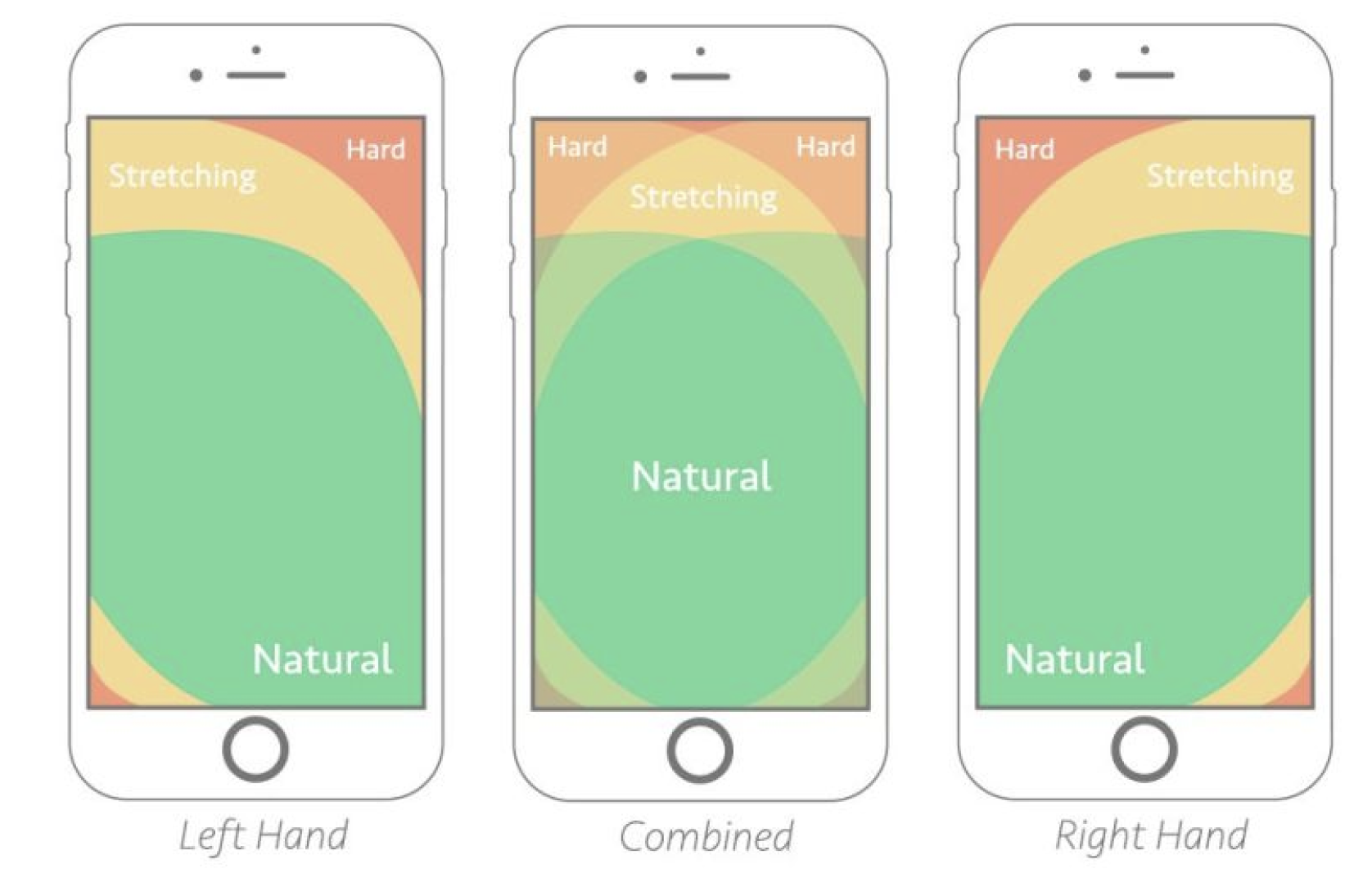
- Mobile-friendly access — layouts, targets, and interactions adapt to smaller screens and touch input without loss of content or functionality.
Focus ring
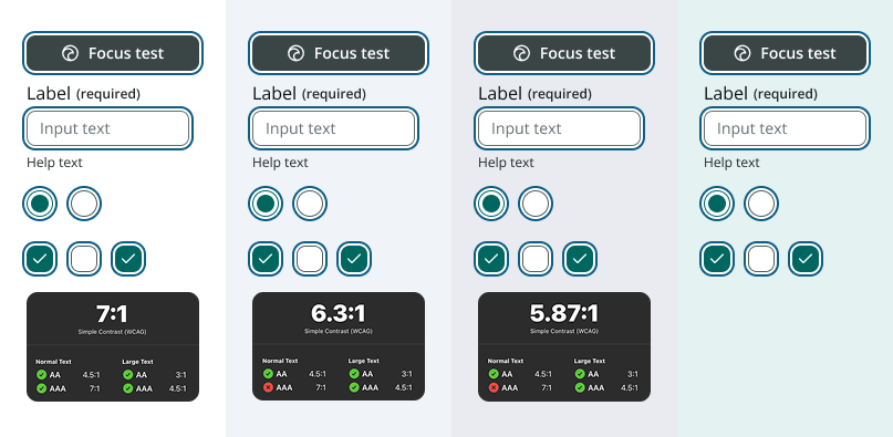
The focus ring uses specific tokens: focus-700 in light mode and focus-300 in dark mode. It features a 2-pixel stroke with a 2-pixel offset:
outline: 2px solid;        /* focus-700 (light) / focus-300 (dark) */
outline-offset: 2px;
Because of Figma's limitations, we add a second border color to simulate the offset, so it may not be perfectly accurate on backgrounds other than the main ones. You can find it as an effect, ready to use.
Light mode — focus-700 ring tested across the main surface backgrounds:
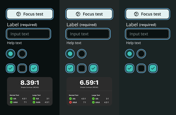
Dark mode — focus-300 ring tested across the main surface backgrounds: