Communicating with images
Visual communication should support Namirial’s value proposition by showing trustworthy, human, and digitally enabled experiences. Image choices should reinforce warmth, realism, diversity, and a modern paperless approach.
Principles
Namirial visual communication should support trusted digital transformation through warm, realistic, and human-centered imagery.
Images should feel credible, approachable, and relevant to real business contexts. The goal is not generic corporate stock photography, but visual storytelling that makes digital processes feel trustworthy, simple, and contemporary.
Color and mood
Approved imagery should use a warm and bright atmosphere, with natural light and an overall welcoming tone. Cold blue-dominant treatments should be avoided.


Do
- Prefer warm, sunlit scenes.
- Favor natural brightness over cold or artificial tones.
- Keep the overall mood positive, calm, and trustworthy.
Don’t
- Avoid cold blue-dominant treatments.
- Avoid visual moods that feel distant, clinical, or impersonal.
People
When people appear in visuals, they should reflect the diversity of Namirial’s audience and market presence.

People imagery aligned with Namirial communication
People should communicate these qualities:
- Trustworthy
- Dependable
- Reliable
- Innovative
- Agile
- Smart
- Open to digital transformation
Expressions should feel confident and positive, with a professional and believable emotional tone.
Image types
Two main image categories can be used in Namirial communication.
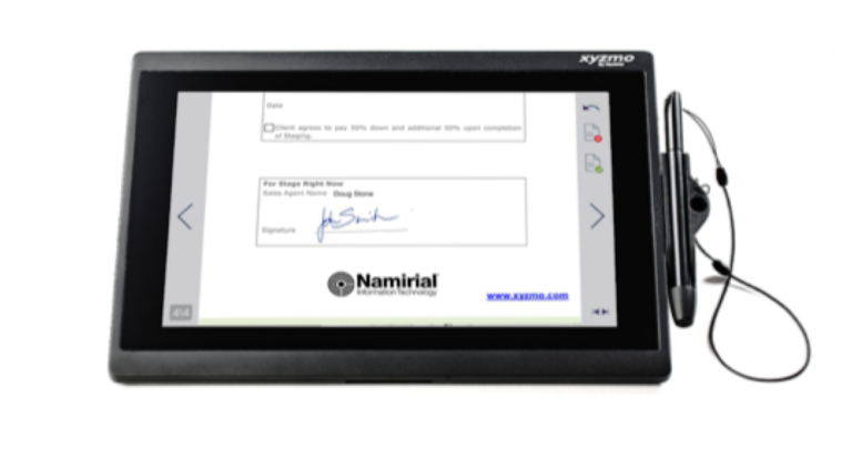
Product-focused imagery: This type of image presents the device and interface clearly, often in a clean and controlled composition.

Product-in-use imagery: This type of image shows devices in context, with people actively interacting with them. It helps tell a story and connect the product to a real task or workflow.
Selection criteria
Image selection should match the buyer persona and help explain how Namirial solves business problems through trustworthy digital processes.
Tier 1 values
These images should reflect Namirial's core value proposition.

- Empowering: show people in capable, enabled, action-oriented situations.
- Trusted: show confident and positive interactions in realistic business contexts.
- Digital: emphasize paperless processes.
- Transformation: prefer modern devices and workflows.
Tier 2 values
These images should reflect broader contemporary work values.

Smart working and new work

Diversity and authenticity

Green and eco-friendly
- Smart working and new work.
- Diversity and inclusion.
- Authenticity over staged corporate scenes.
- Green and eco-friendly environments.
What to avoid
Some visual patterns weaken credibility and should be avoided.

Artificial or overly processed

Distracting or cluttered

Staged or clichéd
Avoid:
- Heavy photoshopped treatment.
- Cluttered foregrounds or backgrounds.
- Messy desks and distracting details.
- Generic business clichés.
- Over-arranged or obviously staged scenes.
Real-life examples
Real-life imagery should show practical digital scenarios in believable contexts.

Real-life example 1

Real-life example 2
These examples should communicate use, context, and credibility rather than simply showing a device.
Realistic graphics
When photography is not the right medium, graphics should still maintain a realistic feel.

Device shapes and mockups
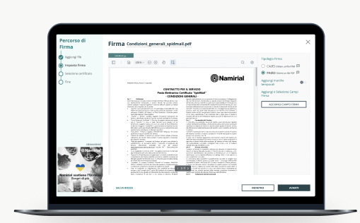
Realistic interface presentation
Graphics should:
- Use modern and realistic device shapes.
- Stay close to actual product usage.
- Use real screenshots or screencasts whenever possible.
- Blur personal or sensitive data in captured interfaces.
Infographics
Infographics can combine realistic device framing, interface captures, and explanatory elements to describe product stories in more detail.
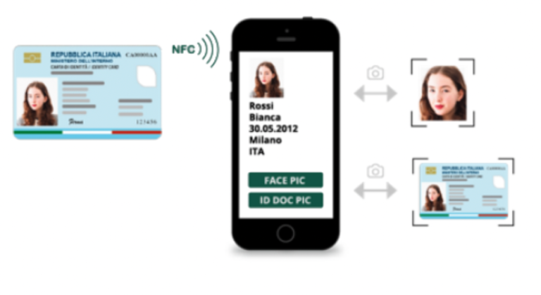
Digital identity or signing flow

Signature or verification flow
Use infographics when a process, flow, or capability needs more explanation than photography alone can provide.
Composition
Composition should support clarity, cropping flexibility, and space for text or logo placement.

Negative space for layout flexibility
Bird's-eye perspective
Useful composition principles include:
- Use negative space to support layout flexibility.
- Prefer clean framing and readable focal points.
- Choose perspectives that strengthen the message, including observer views, eye-level views, and over-the-shoulder product views.